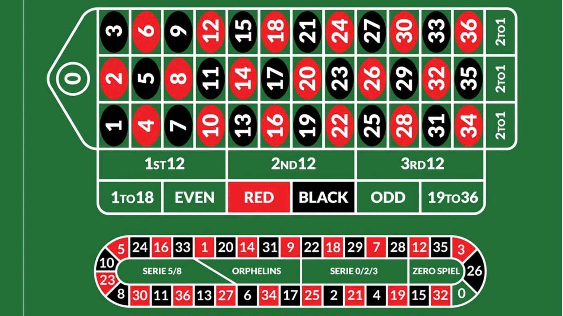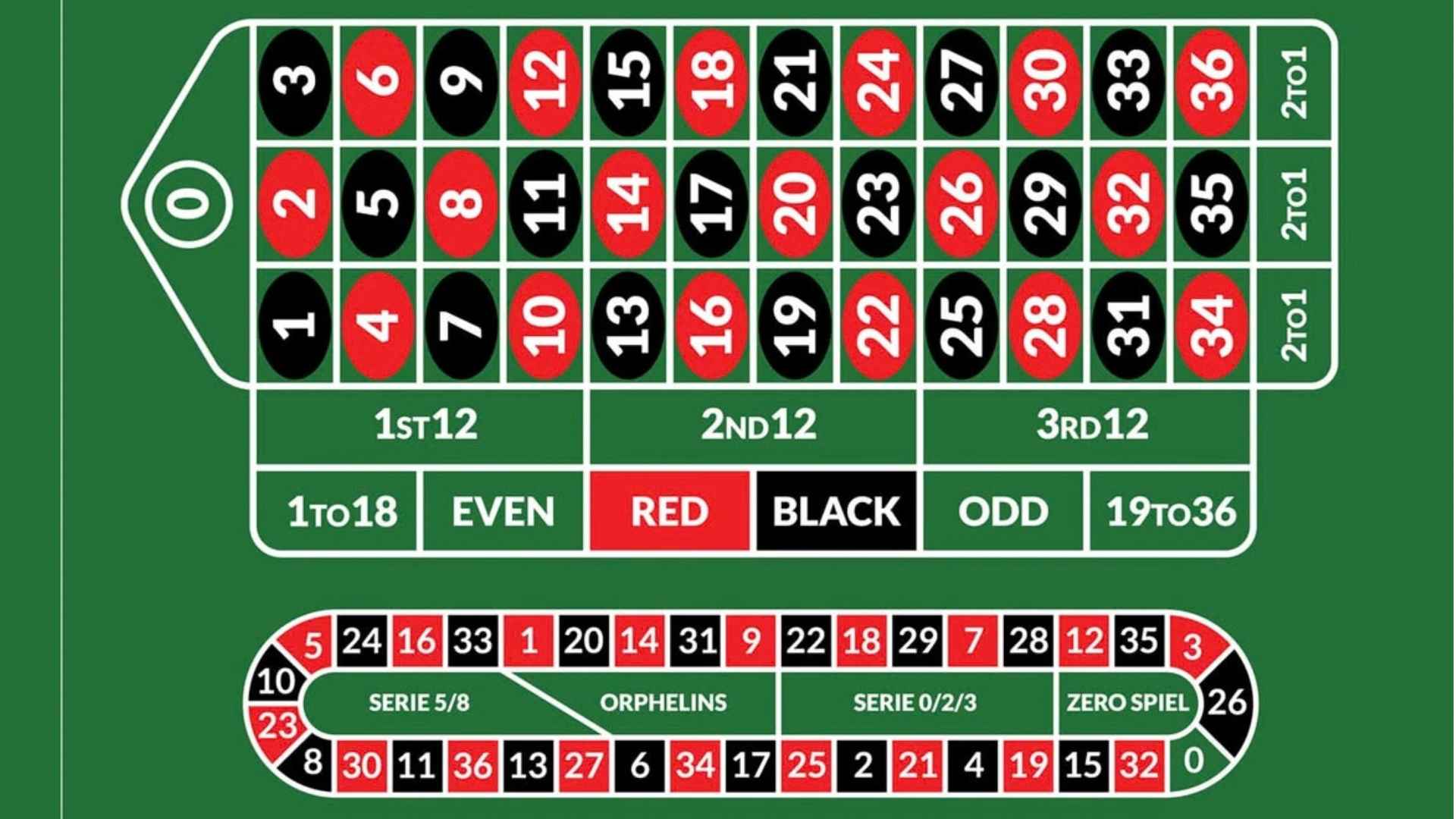
In fast-paced modern gaming environments, presentation directly influences how easily users follow rapid results. Designing interface elements with strong visual contrast ensures that selected numbers stand out immediately during live draws. By optimizing color pairing and typography, developers create an intuitive experience that reduces visual effort for players.
Enhancing Legibility in Dynamic Gaming Displays
High visual contrast allows users to spot drawn numbers instantaneously, even on smaller mobile screens. Using dark fonts against bright, glowing backgrounds or vibrant spheres against neutral drop-shadows helps figures retain maximum clarity. This sharp definition prevents confusion when results update rapidly across consecutive rounds.
Proper visual hierarchy also prevents key draw information from blending into surrounding promotional graphics or background animations. When drawn balls feature strong luminance differences compared to the game layout, players retain focal concentration effortlessly. Consequently, visual clarity forms a cornerstone of modern digital interface design.
Reducing Cognitive Load During Fast-Paced Rounds
Fast draw intervals require players to absorb information in fractions of a second without feeling overwhelmed. Distinct color coding on drawn balls enables quick pattern recognition without forcing users to carefully read every digit. This streamlined data flow reduces mental fatigue during extended gameplay sessions.
When interface elements are visually distinct, cognitive friction drops significantly, leading to a smoother player journey. Maintaining clean boundaries between drawn indicators and upcoming selections builds confidence in tracking active draws. Thoughtful interface architecture transforms continuous numerical updates into a seamless viewing experience.
Accessibility Considerations Across Modern Devices
Designing for high contrast is essential for accommodating users with varying levels of visual acuity or color vision deficiencies. Incorporating distinct shape borders, complementary color choices, and bold typography ensures that drawn numbers remain legible to everyone. Universal accessibility guidelines prioritize contrast ratios to foster inclusive digital environments.
Furthermore, players access online platforms under diverse lighting conditions, ranging from outdoor sunlight to dim indoor rooms. Adaptive contrast ensures that live selection highlights stay visible regardless of screen brightness or environmental glare. Providing adaptable visual options reflects a high standard of platform engineering and user care.
Building Trust Through Transparent Outcome Presentation
Clear graphical rendering plays a vital role in establishing user trust during online draws. When winning balls pop out with unambiguous visual highlights, players immediately verify outcomes without questioning system display accuracy. Transparent presentation reassures users that game results are displayed fairly and accurately in real time.
Ultimately, investing in refined graphic layouts elevates user satisfaction while reinforcing platform integrity. Clean animations paired with high-contrast highlights make complex numerical tracking effortless for casual viewers and dedicated enthusiasts alike. As digital gaming interfaces evolve, visual clarity remains a primary benchmark for exceptional user design.